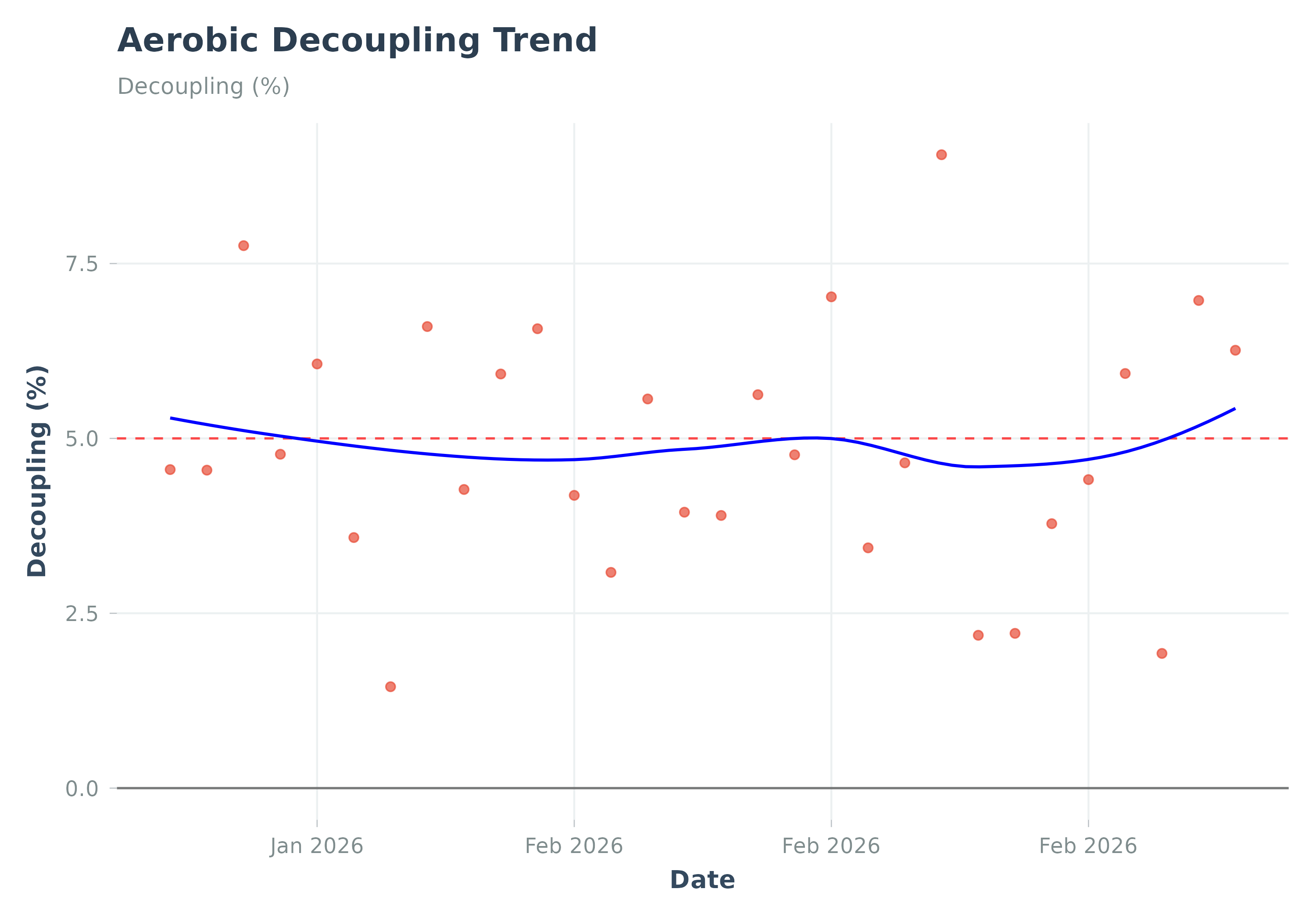
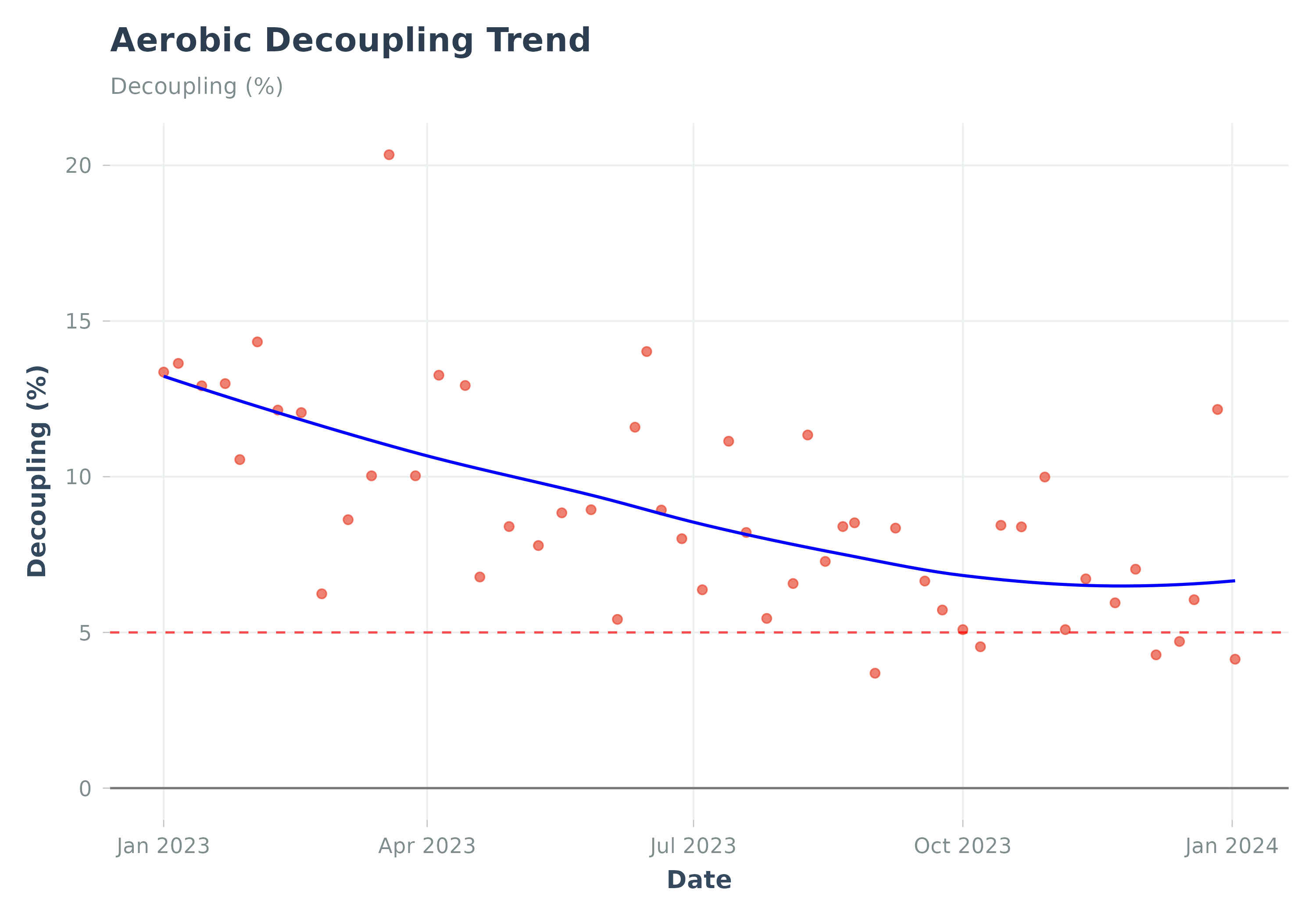
Visualizes the trend of aerobic decoupling over time.
Usage
plot_decoupling(
  data,
  add_trend_line = TRUE,
  smoothing_method = "loess",
  caption = NULL,
  title = NULL,
  subtitle = NULL,
  ...
)
Arguments
- data
A data frame from
calculate_decoupling(). Must contain 'date' and 'decoupling' columns.- add_trend_line
Add a smoothed trend line (
geom_smooth)? DefaultTRUE.- smoothing_method
Smoothing method for trend line (e.g., "loess", "lm"). Default "loess".
- caption
Plot caption. Default NULL (no caption).
- title
Optional. Custom title for the plot.
- subtitle
Optional. Custom subtitle for the plot.
- ...
Additional arguments. Arguments
activity_type,decouple_metric,start_date,end_date,min_duration_mins,decoupling_dfare deprecated and ignored.
Details
Plots decoupling percentage ((EF_1st_half - EF_2nd_half) / EF_1st_half * 100).
Positive values mean HR drifted relative to output. A 5\% threshold line is often
used as reference. Best practice: Use calculate_decoupling() first, then pass the result to this function.
Examples
# Example using pre-calculated sample data
data("sample_decoupling", package = "Athlytics")
p <- plot_decoupling(sample_decoupling)
print(p)
#> `geom_smooth()` using formula = 'y ~ x'


# Runnable example with a manually created decoupling data frame:
decoupling_df <- data.frame(
  date = seq(Sys.Date() - 29, Sys.Date(), by = "day"),
  decoupling = rnorm(30, mean = 5, sd = 2)
)
plot_decoupling(data = decoupling_df)
#> `geom_smooth()` using formula = 'y ~ x'
# Runnable example with a manually created decoupling data frame:
decoupling_df <- data.frame(
date = seq(Sys.Date() - 29, Sys.Date(), by = "day"),
decoupling = rnorm(30, mean = 5, sd = 2)
)
plot_decoupling(data = decoupling_df)
#> `geom_smooth()` using formula = 'y ~ x'